At a time of unprecedented economic need during the COVID-19 pandemic, Nava partnered with the state of California’s Employment Development Department (EDD) to rapidly build a system with a web application so people could confirm their employment status for unemployment benefits, after filing their claim.
Applying user research, real-time web analytics, and an agile workflow, we launched an easy-to-use and secure application in six weeks. Ninety-three percent of people who logged in — 1.1 million in total — were able to complete the multi-page unemployment certification.
User research is integral to the successful and timely completion of a project, especially amid a crisis. Talking to people early and often — and continuously sharing that research with stakeholders — helped the team make iterative improvements to the application over the following five months.
Approach
When the pandemic hit, California moved quickly to meet the demand for unemployment benefits and get these benefits into the hands of as many eligible people as possible. This fast action helped more than one million people receive benefits immediately, but required retroactive certification to verify their employment status.
Just because we had a short timeline didn't mean we had to give up talking to users. Instead, we prioritized user research. Using modern, human-centered design and research practices, we tested multiple prototypes with real people to create the best possible experience for claimants. Incorporating user feedback from the get-go ensured that our limited time was well spent.
Alongside EDD, we were able to launch the application quickly and ensure that it met people’s needs. As a result of our research, we added features to better support people's progress through the app: a timeout warning modal, the ability to save progress, and more details about next steps on the confirmation page.
Outcomes
Within six weeks, California launched a secure and easy-to-use certification web application, so claimants could certify their employment status and keep their benefits.
Ninety-three percent of the people who logged in successfully completed the multi-page unemployment certification. By the close of the certification window, we successfully certified 1.1 million people.
The EDD Strike Team described our solutions:
This tool allows a positive user experience for claimants while meeting an unexpected rule requirement from DOL. The creative and functional mechanism for tying data back to the database and focus on user experience should be emulated in future improvements.
Process
Expediting decision-making with a prototype
On day one, the team collected and distilled input from stakeholders to create a working prototype. This prototype allowed us to test initial ideas, establish the major pillars of the user experience—for example, a single objective for each page of the application—and gain official approval within a week to begin building the application.

The first prototype established a single objective for each page of the application, a pattern that was adopted for the final design.
The prototype let us get immediate feedback so that we could quickly iterate to make improvements. Using it alongside EDD program experts led to one of our biggest design pivots: We learned that some information could be pre-populated in the application to minimize effort for claimants. Our team further improved the prototype in three days by adding Spanish translations and different claimant scenarios. With these iterations, we were ready to begin usability testing.
Researching to identify and prioritize user needs
Using a tool called Ethnio, we quickly screened, recruited, and scheduled a diverse group of eight research participants from 225 volunteers. Interviewing eight people would generate enough user data to build out the application, while still adhering to the tight timeline.
We employed task-based usability testing to directly observe and learn from how people responded to the application prototype. In task-based usability testing, participants are given common task scenarios and asked to use the prototype to complete them. During this testing, we learned that 88 percent of research participants didn’t understand what a required piece of information—a unique customer number called the EDDCAN—was or where to find it. So, with a green light from our partners at EDD, we removed that requirement and replaced it with a date-of-birth identifier. This small adjustment made the application sign-in process significantly easier to complete.
We also learned that claimants weren’t sure they could trust the new app because it didn’t use the text message notifications they were familiar with. In response, we ensured the app notified people through the same text messages they knew. Sending reminder messages by text resulted in an uptick in traffic to the application and completed certifications.

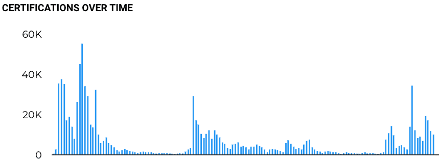
Certification upticks directly correlated to reminders from the EDD communications system.
Importantly, taking the time to research didn’t hinder our progress; it made us more efficient, helping us to understand and prioritize the most impactful improvements. We heard directly from claimants about possible obstacles to completing the process and made adjustments along the way to increase the likelihood that they would be able to submit their application.
Working in parallel to accommodate tight timelines
Once our engineering, design, delivery, and product teams fully understood our stakeholders’ needs, we set out to divide and conquer. Each cross-functional team worked in parallel on abbreviated timelines to meet the six-week deadline.
For example, it usually takes at least a week to conduct research and synthesize recommendations. But for this project, we took a single day to conduct the research and synthesized it immediately afterward in order to deliver same-day recommendations. We also simplified what would usually be a full research report into an actionable chart. This enabled us to rapidly prioritize tasks alongside our stakeholders.

In about one month, we prototyped, tested, and deployed California’s certification application.
At the same time, the engineers could begin building the app based on the information provided by the prototype. Our research, in turn, informed design and engineering decisions. This continual feedback loop resulted in a rapid launch—within four weeks.
Involving stakeholders in user research
Research and design processes can seem mysterious to people who aren’t familiar with them. But maintaining transparency fosters better outcomes in the services we deliver and helps us build more quickly.
To make the research process transparent for stakeholders, we invited them to join as observers in usability testing sessions. At the same time, we took several steps to maintain privacy for testing participants. The first was the creation of an “observation document” that removed personally identifiable information. In this doc, we shared when interviews were scheduled so government stakeholders could sign up to listen in. We also notified participants and got consent to having observers on the line. But during sessions, participants could only see and hear the researcher they were talking directly to.
Including EDD stakeholders in the interviews allowed them to hear direct participant feedback on the prototype. In response, they could add their own insights and knowledge about the certification process in the observation doc. Sharing all of this information helped us align with stakeholders on usability improvements. Afterwards, multiple stakeholders expressed appreciation at being able to gain a firsthand understanding of the claimant experience.
We also created a data analytics dashboard that anyone on the program could access in real time to inform decision-making. When we needed to improve the completion rate of the application, we all frequently referred to the analytics dashboard to understand the impact of our outreach strategies. We could see, for example, that sending reminders from the EDD communications system directly correlated with an increase in certifications.
Using the same tools and processes helped us effectively collaborate with stakeholders throughout the project.
Conclusion
Rapidly delivering an application in a time of crisis requires decisive action and close collaboration. By creating a prototype, prioritizing testing, and working in parallel, we were able to launch a user-friendly application within six weeks. Despite a tight timeline, we didn’t need to forgo usability testing. Instead, learning from real claimants sharpened our decisions, ultimately resulting in a high rate of successful certifications.
The certification application was meant to be a solution for a temporary problem, allowing the state of California to gather necessary information. By resisting shortcuts, championing an iterative process, and prioritizing the end-user experience, Nava and our partners at EDD accomplished our shared goal: ensuring that Californians were able to receive and maintain the right unemployment benefits for them.
Learn more about this work in our Public Benefit Report.
Written by

Designer/Researcher


