Intro
Nava worked alongside Montana to build a digital eligibility screener tool to help make it easier for people to apply for the state’s WIC program. This open source prototype was part of a 6-month demonstration project, made possible with support from Schmidt Futures—a philanthropic initiative founded by Eric and Wendy Schmidt—that sought to help expand Montana WIC’s reach. The other component of the project involved building an Application Programming Interface (API) prototype explained in this case study. We built the API prototype to learn more about the process of managing participant data for Montana WIC’s staff and inform a national API standard that would break down systemic barriers to WIC modernization. Through research and testing, we designed and built a prototype for an eligibility screener tool. This screener served as an intake form, allowing applicants to start the enrollment process virtually while helping some staff more easily process enrollments.
Approach
In 2020, Nava published a landscape report with the National WIC Association (NWA) to understand how COVID-19 and a shift to remote services impacted how WIC participants enrolled and received benefits, and how WIC staff facilitated these processes. In that report, we identified interest from WIC staff across the country to continue offering remote service options to help ease the process of enrollment for WIC participants. Yet many WIC agencies lacked the digital tools that made integrating these options less burdensome. Through this demonstration project, we prototyped two tools to build understanding towards interoperability—or enabling information exchange between different technological systems—for WIC.
Alongside Montana, we built a prototype for a mobile-first eligibility screener web application. This screener would help potential participants start the process of applying for WIC benefits without calling or going into a WIC office in-person. Once submitted, the information from the screener would serve as useful intake data for WIC staff. Staff could then call potential participants for an informed follow-up enrollment conversation, saving participants the burden of calling the clinic themselves.
This prototype was the first virtual eligibility and enrollment tool WIC Montana pursued, empowering participants to take the first steps towards enrollment remotely. Because this project was a demonstration, the prototype was intentionally small in scope, and we identified many opportunities to research and learn more about how interoperability could benefit WIC agencies across the country.
Outcomes
Through the development of this screener, we learned by interviewing WIC participants that many yearn for a more hybrid, or online and offline, experience with WIC. Recent research also suggests that a hybrid delivery model would be effective and well-liked by participants. One recent study found that most WIC participants were satisfied with remote service delivery, while a research brief from FNS says that “Nearly all State agencies reported that the physical presence and remote benefit issuance waivers ultimately made WIC safer, more accessible, and more convenient for participants’ schedules and a large majority reported that the two waivers improved access to food during the pandemic.”
Tools like our screener give participants the option to learn more about eligibility and start the application process virtually alongside these crucial in-person or phone interactions with staff.
For WIC staff, we learned that some saw the screener data as a means to have a more informed conversation, while others struggled to feel like the screener was collecting enough information to feel truly actionable. Though the screener can help ease that process, especially when paired with APIs that allow WIC agencies to more easily share and transfer data between tools, it’s important to ensure that modernizations do not add additional burdens onto WIC staff.
Nava also helped support Montana WIC to adopt a more agile, human-centered design approach to building technology, including processes such as user research. As Kevin Moore, Vendor Lead for Montana WIC, said about our work:
“We don’t have the capacity to take on any of this, but we know what is out there. Having an organization that is completely committed to that role with government programs has enabled this whole thing. I am not sure—it’s a tall order for other state agencies to replicate this project without the capacity and expertise from an organization like Nava."
"We work with a lot of for-profit technology companies and they just build what we tell them. It’s not a system that works well. Working with your organization has been different in that way… the third leg of the stool, we need intermediary organizations that are committed to helping these types of programs. State agencies aren’t going to be able to do a lot of this on their own, from what I have gathered.”
Process
We started by researching participant and WIC staff needs and expectations through user interviews as well as previous research from other organizations in this space. Using this, we built out a service blueprint to capture how user inputs, staff processes, and different systems all supported how Montana WIC serves participants. We learned that WIC staff needed to validate data with an applicant before entering information into their system. So, we set out to design a screener that would serve as an intake form for WIC staff, giving them the right information to schedule certification appointments with applicants on the phone or in-person.
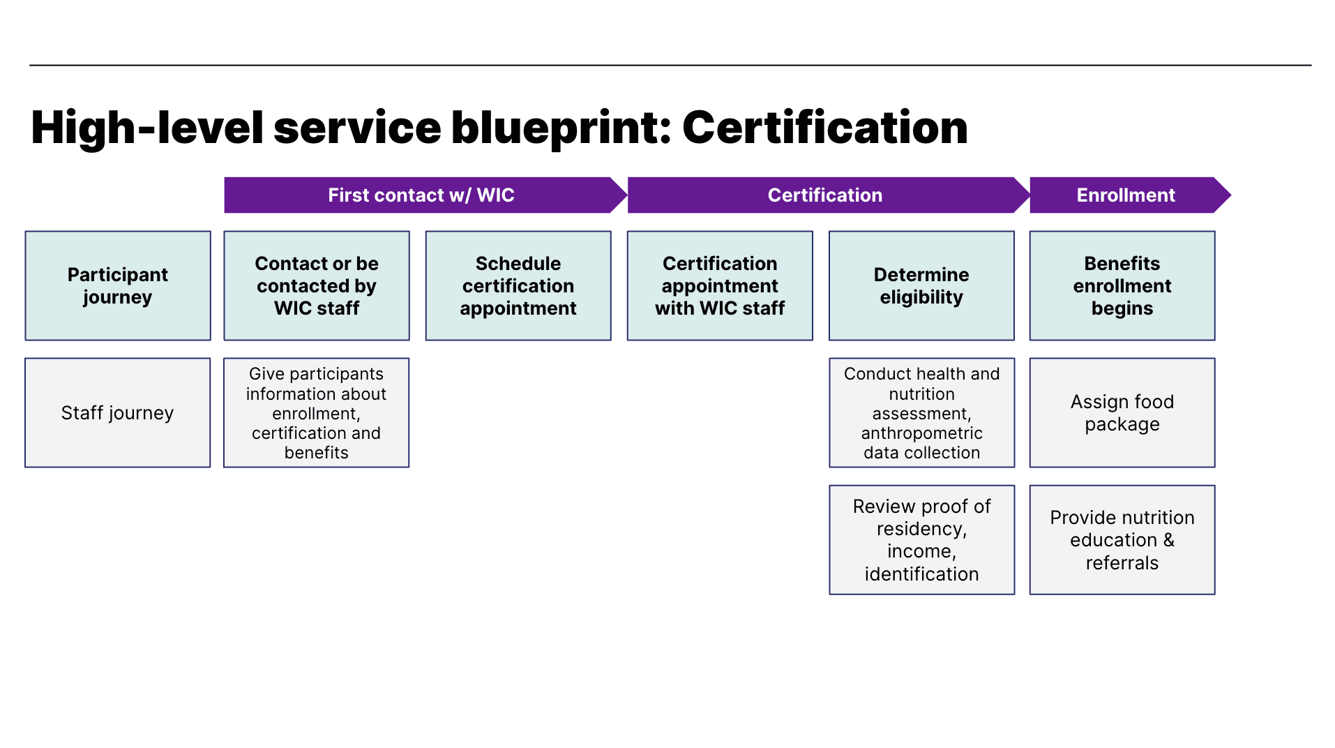
A screenshot of our service blueprint.
Based on what we learned, we scoped out the information we'd need to include in a screener. A potential participant would need:
Introductory and explanatory content
To answer basic questions about eligibility and income
To choose a WIC clinic to contact them
To include their contact information
To potentially see links to other benefit programs if they screened out of eligibility for WIC.
We decided to try and push as many applicants through the screener as possible and have staff receiving this information ultimately decide if an applicant qualifies for benefits. Because WIC can be such a personal and individualized program for participants, we did not want our screener to make eligibility decisions. Our screener would only disqualify someone if they didn't meet location requirements or categorical eligibility criteria, such as being pregnant or having a child under five years old.
We also made some additional decisions about the screener:
We wanted to make sure that what we wrote could be translated into Spanish, the next most spoken language in Montana. Even though translation was out of scope for the prototype, we designed structured templates in the code to make future translation easy.
We made the decision to use a design system and chose the United States Web Design System (USWDS).
A content-first design
The design of the eligibility screener started with written content. In our research phase, we asked clinic staff how they determined eligibility with people who called in on the phone. We took what we learned and designed a user flow, using that as the basis for two concept designs:
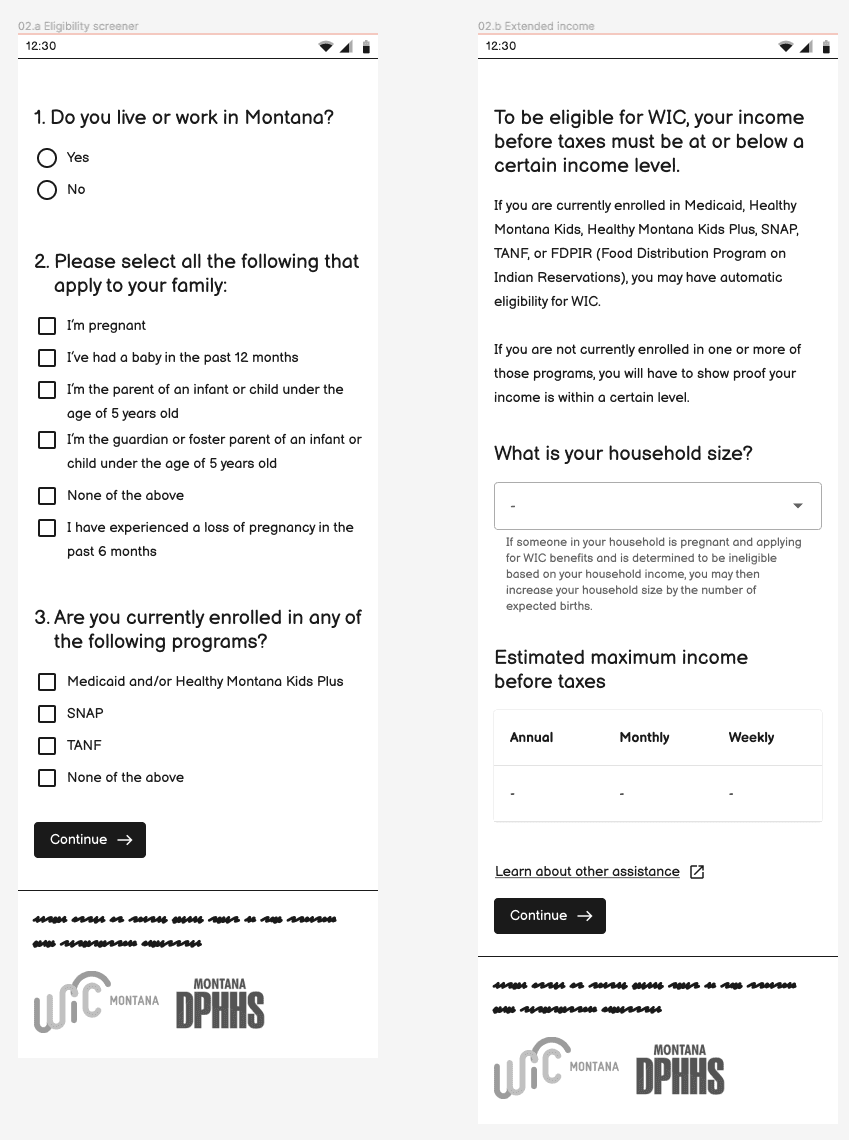
A screenshot of the web app concept, demonstrating the initial eligibility questions we outlined.
One concept was a traditional web app design, where eligibility questions were broken into pages and linked together. The other concept broke the content down into SMS messages and used simple yes/no questions to collect the majority of this information.
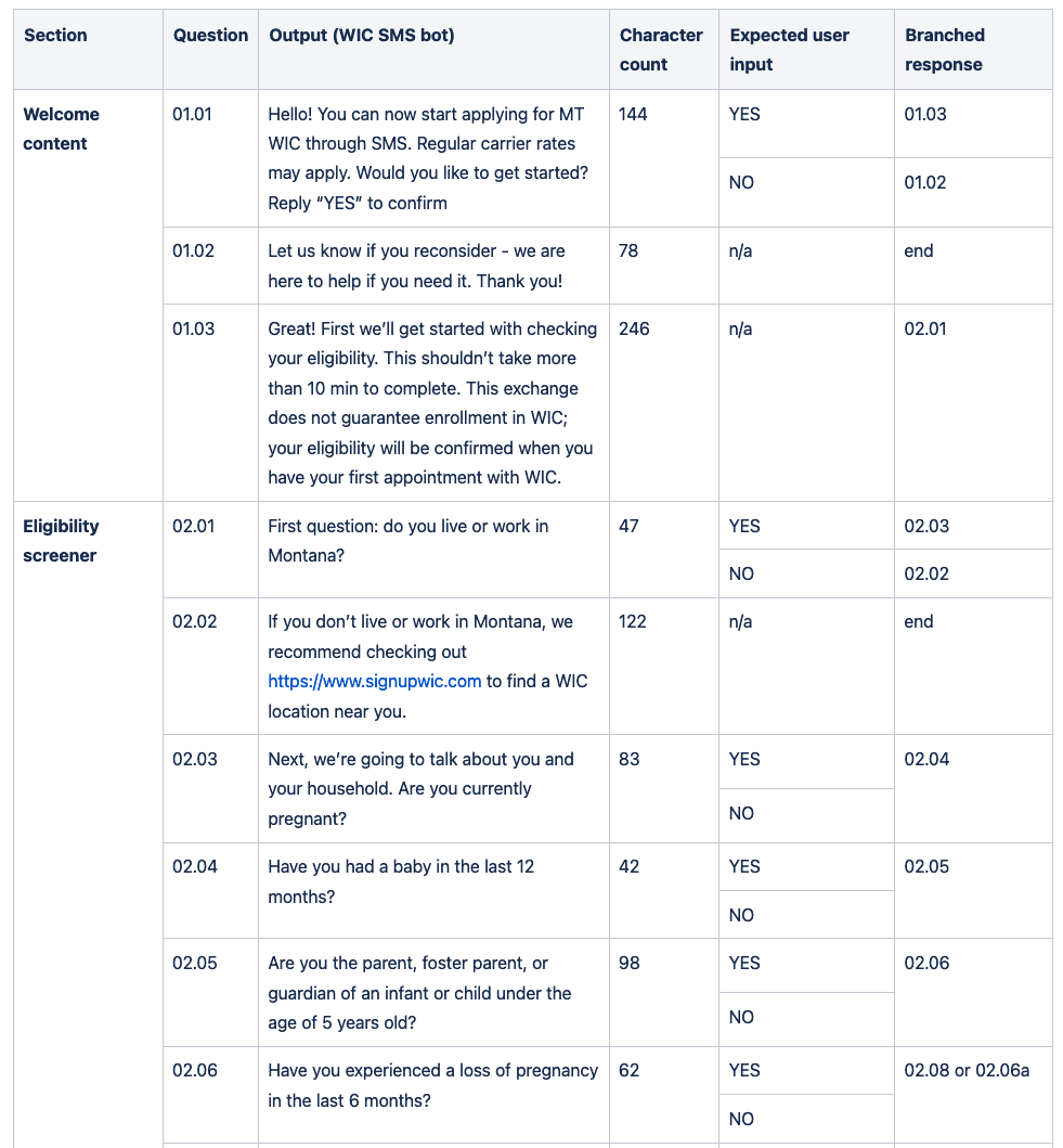
A screenshot of the conversational script and protocol we drafted to support testing an SMS-based eligibility screener concept.
Each of these concepts was user tested, and though both were compelling, the web app concept allowed us a little more flexibility, such as offering explanations or links to Montana materials about eligibility if a user wanted to dive deeper into the parameters. We integrated all findings from our research and testing into our designs, content, and product approach.
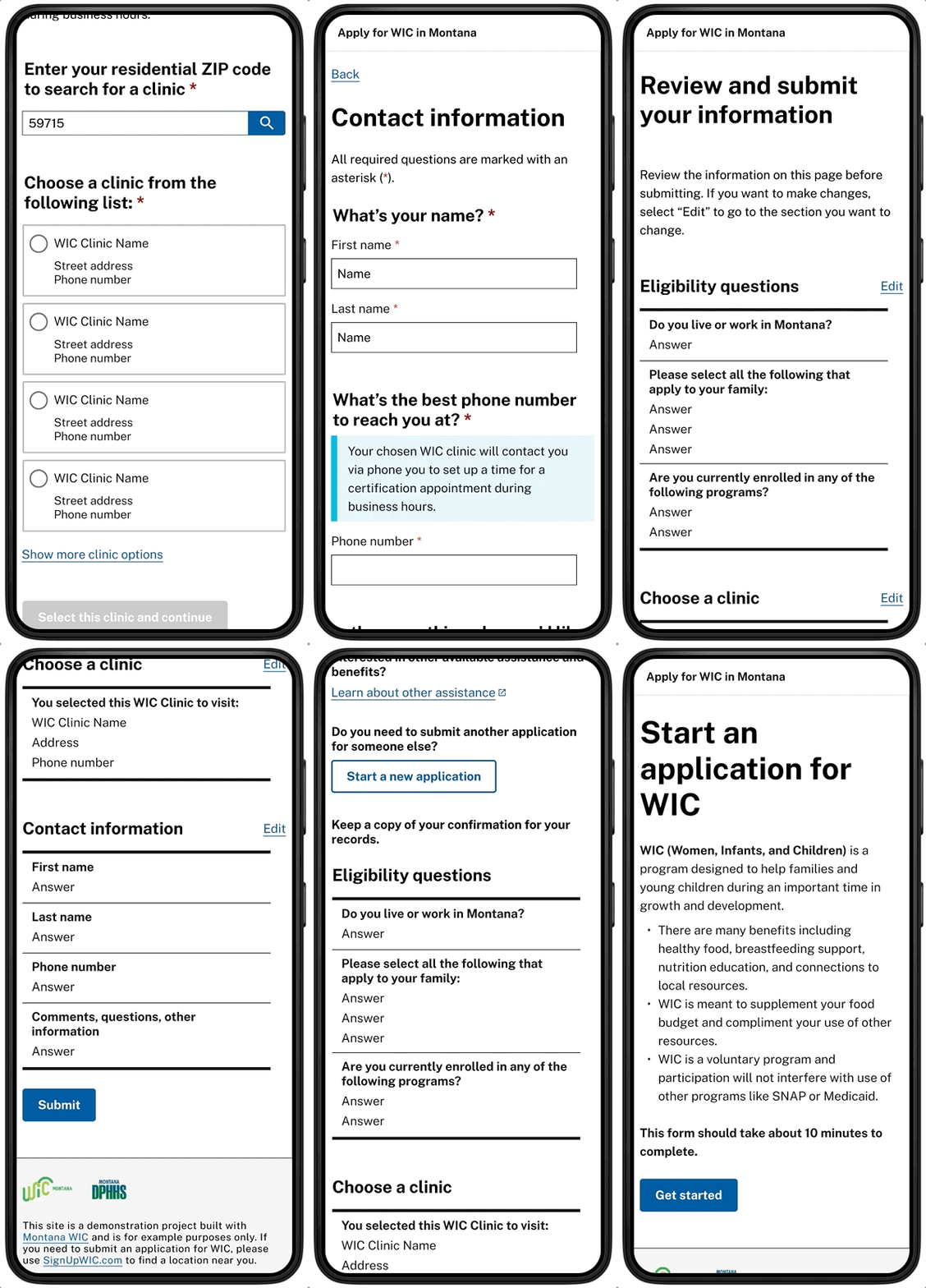
We started to design more high-fidelity wireframes using U.S. Web Design Styles in Figma. We also hosted co-design sessions with staff at two WIC clinics to get feedback on the language, visual approach, and the output of the screener itself: a comma-separated values, or CSV, file of a participant’s data processed via our API prototype.
A near-term solution for those who might fill out this screener for a family member
In our co-design sessions with staff, we learned that staff wanted a way to tell if someone had participated in WIC before. Typically, clinic staff used a date-of-birth to determine if an applicant was already in the system or not. This was easy information to collect on the phone, but in the screener, there were some other challenges.
The screener asked questions using an ambiguous "you"—someone applying on behalf of themselves or someone in their family. Because we had planned the next step to be a phone or in-person conversation with a WIC clinic staff member, if we decided to collect "date of birth," it could cause confusion. The person using the screener could be a parent, grandparent, guardian—they could be eligible themselves, or acting as the "authorized representative" for an eligible infant or child. This information is easy to figure out on the phone, but trickier to communicate through our screener tool.
Additionally, we decided to be broad in pushing applicants through the screener since staff would make eligibility determinations through follow-up appointments. Given that, we decided not to ask for a person’s date-of-birth as part of this screener prototype.
As a middle solution, we decided to add the question "Have you, or someone in your household, been on WIC before?" This way, staff would know to ask about previous benefits in their follow up call, but could also get more helpful contextual information, such as the last time the participant received benefits, or who would ultimately be enrolled in this program.
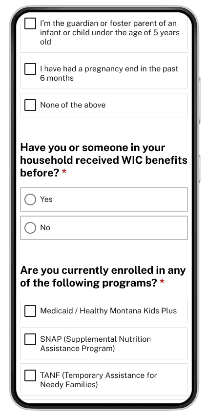
A screenshot of the "Have you or someone in your household received WIC benefits before" question from our prototyped screener.
Building the eligibility screener
For the eligibility screener, we wanted to prioritize building a modern, responsive web application that would support our human-centered design approach. We chose Next.js because it is a popular, open source React framework that has a strong developer community. During our development process, we used Storybook to document all of our React frontend components and Jest to handle all of our unit tests.
We architected the eligibility screener as a multi-page form wizard. As the applicant fills out fields on each page, the application temporarily stores data in the applicant's browser using the Javascript Web Storage APIs. This prevents data loss if the applicant refreshes the page before submitting, either by accident or due to network interruption. We chose to use session storage instead of local storage in order to prioritize protecting data privacy for applicants that might be using a shared computer, such as at a public library.
The eligibility screener was designed so that it could be built as a Docker image and deployed as a Docker container. Using this approach provided flexibility for application deployment. For our demonstration project, we used AWS Elastic Container Service to launch and manage our containers. However, by using Docker as the underlying base layer, the application can support other platforms (e.g. Azure, GCP, Digital Ocean, etc) and orchestration tools (e.g. Kubernetes, Docker Swarm, etc).
Conclusion
An online screener, or interest/intake form, has the potential to make it easier for applicants to enroll in WIC. But screeners must be designed thoughtfully—for example, we learned that the amount of information a screener asks can make the interested WIC applicant think they have completed an application for WIC, when they have not.
Additionally, it’s important that new tools do not transfer burden from participants to staff. For example, each WIC case is very different, and for very simple cases, the screener provided enough information for a WIC staff member to schedule an eligibility appointment and undergo a simple intake process. But for some test cases we looked at, when an applicant wasn’t receiving other income-based benefits such as Medicaid or SNAP, for instance, staff wanted additional personal information from applicants—in this case, income documents—to better determine eligibility.
There’s more to research on the utility of an eligibility screener. With more investigation, we’d like to find a happy medium between clinic staff getting enough information to take informed action and correctly setting expectations with potential beneficiaries around the rest of the eligibility and certification process.
Special thanks to Sasha Reid who is serving as a Solutions Architect on this project and contributed to this article.
Written by

Principal Software Engineer

Principal Designer and Researcher

Director of product

Strategic communications manager
