Introduction
We did not set out to start a company – we were brought together during an urgent and chaotic time to help fix HealthCare.gov. But while we were brought in as a temporary team, the issues we saw were anything but temporary. The structural and systemic challenges we saw reflected deep cracks in our civic life. Fault lines spanning generations, broken and brittle relationships between people and the government that’s meant to serve them. At the same time, we found partners and dedicated civil servants showing up, day after day, for the people. We decided, together, to find ways we could help.
We started Nava with a mission: to improve the accessibility, effectiveness, and simplicity of government services. We formed as a public benefit corporation because we believe that all corporations have a deep social responsibility to the people affected by their work, and to the broader public. For organizations working to improve public programs that affect millions of lives, this should be the norm, not the exception.
How far we’ve gone
We’ve learned a lot of hard lessons in the last four years. We’ve thrown ourselves at the center of projects that have felt impossible at times and have learned the hard way that burnout is not a badge of honor. But we’ve also grown significantly, both as individuals and as an organization. Four years in, a team of six is now seventy, headquartered in DC with offices in San Francisco and New York, and a growing cohort of distributed employees across the country. Nava now represents over 44% women and over 46% underrepresented backgrounds in tech, with leadership represented by majority women and 45% people of color. As a public benefit corporation, our fiduciary duty is not only to our shareholders – current and former Nava employees – but to our mission and the positive impact we hope to achieve.
In our first public benefit report, we're proud to share how we worked with and learned from our government partners to help tens of millions of people better access critical services. We scaled infrastructure for programs that process hundreds of billions of dollars each year and improved the simplicity of back-office processes to shave off decades of labor. As a whole, the programs we’ve worked to support, from Medicare to Veterans Affairs to HealthCare.gov to Medicaid, provide benefits to over a quarter of the population of the United States. But there’s still so much more work to be done.
Where we’re going
And while we’re four years in, we’re just getting started. We imagine a world where public services are trusted, efficient, and easy to use, and policy is driven by user needs. We imagine a world where companies that build and support systems for governments are held accountable, and where technology is applied for problems that suit it, in ways that open doors, not build barriers. And while these are lofty goals, they’re neither easy nor inevitable.
Progress is not free, which means progress costs something. Progress costs time, effort, attention, patience. Progress takes work, work we’re grateful to be a part of, work that involves civil servants, caseworkers, policymakers, work that will take years and decades to realize, work we hope you’ll take part in too.

Rohan Bhobe
CEO

Sha Hwang
COO
Better foundations, not better facades
The structural and systemic challenges we face in our daily work reflect deep cracks in our civic life. Fault lines spanning generations, broken and brittle relationships between people and the government that’s meant to serve them. Yet, day after day, dedicated civil servants show up to do what they can to make things better for the American people. They've taught us that to truly spark change, we must always resist the quick fix in favor of pursuing the underlying cause. We must build better foundations, not better facades.

An equitable, human-centered safety net fit for the digital age
Our social safety net is a constellation of services and programs, but it’s often an obstacle course where, the more help you need, the harder it gets. In a nationwide initiative to build an equitable, human-centered safety net fit for the digital age, Nava partnered with Code for America and the Center on Budget and Policy Priorities. Our mission: to radically improve government services for people who find themselves living at or below the poverty line.
After visiting ten states to understand the experiences of people who rely on and manage the social safety net every day, the initiative launched five small-scale pilot sites around the country. Nava partnered with the State of Vermont to make it easier for people to access state-administered benefits like free or low-cost health care and assistance paying for food, fuel, and daily expenses. Recognizing that accessing public assistance programs can be difficult for the people who need them and for the people who manage them, we're focusing our work with Vermont on improving experiences for both beneficiaries and State staff.
During our initial research, we learned that Vermonters faced another hurdle after completing the complicated application process: documents to prove their eligibility. The State of Vermont wanted to address the burden of document submission and minimize the expense of time and money people incurred at this step.
In a few short months, Nava worked with the State of Vermont to launch two test programs that have made measurable improvements. Before, people had to mail or deliver documents in-person during business hours, spending money on postage or transportation to do so. Now, they can submit documents on their own time, from wherever they are, using the device they have, whether it’s mobile, tablet, or desktop. As a result, 30 percent of people submitted outside of business hours and 50 percent used a mobile device to submit.
In total, our test programs reduced the amount of time from application submission to benefits processing by 40 percent. Before, the majority of applicants waited days for their documents to arrive through the mail and longer for them to be processed; only 11 percent were able to submit within one day. During the test programs, 55 percent of applicants were able to submit their documents in one day.
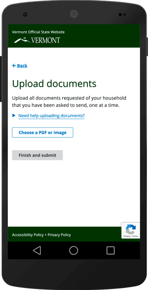
An example of a page on the website where Vermonters can upload and submit documents needed for eligibility.
Tester
Our data is backed up by positive feedback from users. As one certified assister—someone who helps people understand, apply, and enroll in public assistance services—shared:
"For one of my clients who was dis-enrolled from Medicaid, I scanned and uploaded his income verification [using the new documentation uploader]. Within three hours, I was able to call him and tell him his Medicaid was active. It was amazing."
In the first months of the test programs, hundreds of people were able to quickly submit verification documents. And, the State of Vermont is on track to provide this service to every Vermonter applying for any human services program by the end of 2019. In the meantime, we worked with the State to expand use cases that the uploader could support, including helping people with urgent medical needs submit documents to get health care coverage within hours.
This improvement has proven critical. Hospital staff shared one anecdote about a deaf father of four who urgently needed cancer screening but was unable to schedule the expensive tests until he had coverage. “In his case, [using the uploader] was huge. Everybody was standing with bated breath waiting for his Medicaid to be active so we could get him scheduled,” said a hospital staffer.
Getting what you need from government should always be this easy.
We’re grateful to our partners in the State of Vermont for fully embracing a human-centered approach and supporting the eventual open sourcing of this work so it can be adopted and implemented in other states.
Using product management to ship the largest change to Medicare
Government agencies deliver urgent and high impact services. Ensuring that these services are human-centered and built on time and on budget is no small feat. When we got the chance to partner with The Centers for Medicare & Medicaid Services to improve the accessibility, effectiveness, and simplicity of Medicare's Quality Payment Program, we understood the incredible potential for positive change. We also understood what it would take to get the job done: a strong product management practice.
As the largest modern update to Medicare, the Quality Payment Program (QPP) is designed to push the $705 billion Medicare ecosystem forward. QPP is changing how Medicare providers are paid, rewarding doctors for the quality and value of care rather than volume of services. Aligning doctors' financial incentives with the best outcomes for patients ensures that 34 million Medicare Part B beneficiaries get the highest quality health care.
We joined more than 300 people, including civil servants from CMS, the United States Digital Service, and a cohort of contractors to build the technical architecture that would allow the federal government to gather and evaluate performance data about health care quality and adjust Medicare payments accordingly.
To unify this large team, we aligned on this product vision: Medicare’s Quality Payment Program delivers real-time, actionable feedback to doctors so that they can deliver high quality, cost-effective care to patients.
In government projects, the product vision directly links policy requirements with user needs. It also provides a common goal to prioritize everyone’s efforts against. In this case, the product vision enabled us to build the first open application programming interface (API) in the history of similar programs at CMS. Our API is now used by providers, registries, and electronic health record companies who submit the performance data of over half a million clinicians. It’s processed more than 44,000 submissions in one day and has been up and running 99.99% of the time.
But when we began, our research showed that future users of the API were nervous. Previous attempts at similar programs had opaque results. It was incumbent on us to prove that change is possible.
Change like this, that spans teams and initiatives, requires civil servants and contractors alike to use product thinking. Product thinking helps to draw connections between silos and map out the pieces, players, and channels needed to create a human-centered service. In this case, that meant we had to do more than just release the API.
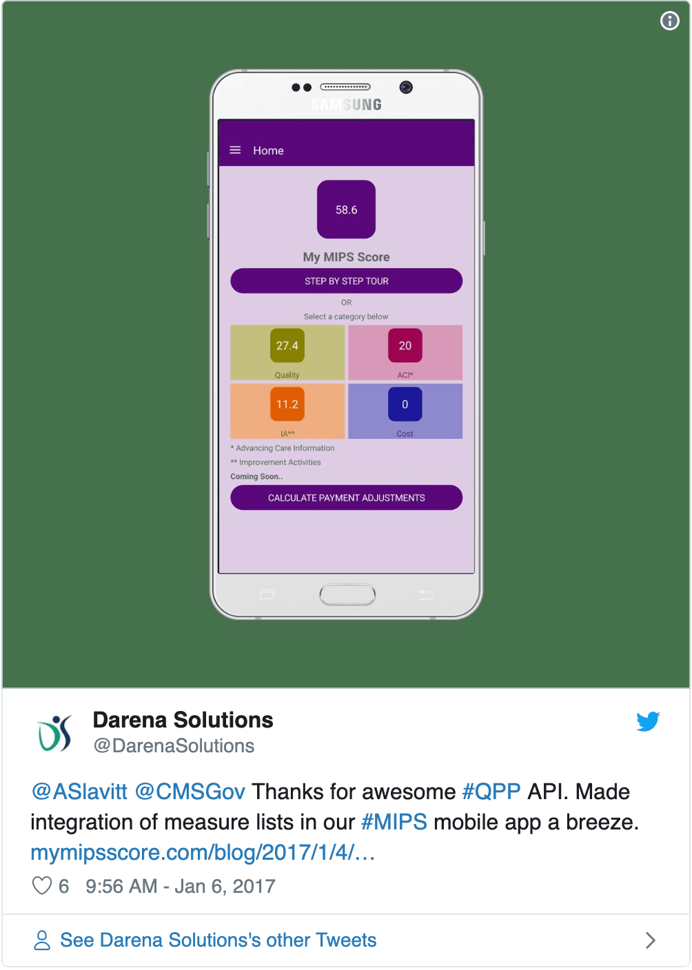
QPP user shares how easy it was to submit performance data to the API.
To ensure it would be adopted, we built an interactive tutorial to guide providers, registries, and electronic health record companies through the process of submitting performance data to the API. We also created Google Groups so people could support and learn from each other. These pieces were released in a beta so clinicians, administrators, and developers could test it all out with little risk. Thanks to the product road map, we had the time and resources to safely implement all the tools and networks required for QPP’s success.
The product management practices used throughout this project are now being replicated across CMS to help other teams efficiently deliver human-centered policies and services. And, the provision of open tools and networks means that Medicare can continue to innovate and drive improvements for years to come.
Be active stewards
The work we do affects the lives of millions of people. The stakes are extremely high, so the standards we hold ourselves to must be even higher. In order to meet them, we listen closely to the communities we serve and strive to develop a nuanced and insightful understanding of their experiences and needs. Being stewards of these stories is a privilege. It means we can build tools that will be lasting, accessible, and truly helpful to the people who need them. We then document what we do and learn from the work of others so that we can all hold safe what’s entrusted to us.

Plain language templates for researchers working with and for government
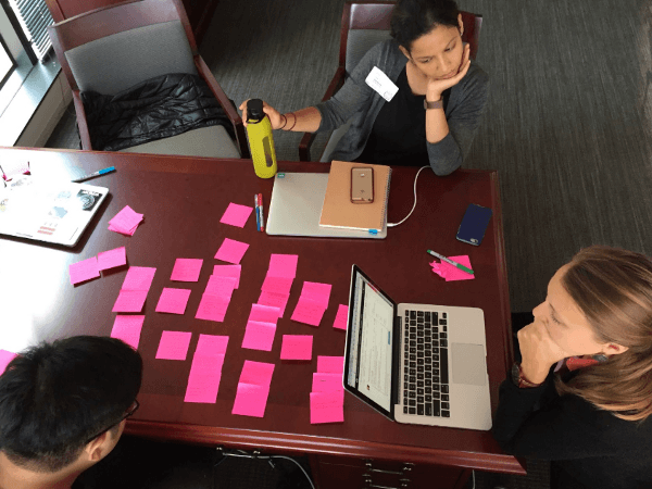
Nava designer Sneha Pai and product manager Lauren Peterson.
Nava’s researchers often interview people who are trying to access government services because they’re in a challenging moment in their lives. Telling a stranger that you can’t afford groceries or are in debt after medical procedures is difficult. It’s our job to create a safe space for these stories to be shared.
As researchers, we must be caretakers of these stories and the people who share them by explaining our process and how we protect their privacy in plain language. When people can easily understand exactly how we use what they share to make government services simple, effective, and accessible for people like them, they’re better able to decide if they want to take part in our research.
Earlier this year, we worked with Harvard's Shorenstein Center on Media, Politics and Public Policy to make plain language templates to help researchers everywhere easily honor the participant’s right to privacy. These templates are informed by our work across our portfolio. We first created them to make it easy for Nava researchers to quickly deploy these practices on our projects, and we’re sharing them here in hopes they’ll help others do the same.
Find all of our templates here, including ones for:
If you have feedback about the templates or would like to share how you’re using them, we’d love to hear from you. Let us know what you think by sending a note to design@navapbc.com.
Building for the long term
There is a growing generation of government legacy systems, often the first digital systems of their kind, that need to be replaced. Rebuilding and remaking a system that is deeply intertwined with a program’s mission can be delicate, risky work. In close collaboration with our partners, we take a profoundly long-term perspective in order to deliver the right thing for right now and for years to come.

Building scalable and secure identity management for HealthCare.gov and MyMedicare.gov
Identity management makes it possible for millions of people to access critical government services. But if identity systems are built on brittle technology or if it's confusing to log in, remember passwords, verify your identity, or create new accounts, people can be locked out of programs entirely.
One example: when HealthCare.gov launched in 2013, the login system had serious performance issues and suffered frequent outages, preventing millions of Americans from easily enrolling in health care coverage.
Nava worked with The Centers for Medicare & Medicaid Services to build the Scalable Login System (SLS) to address the scaling issues with HealthCare.gov's original enterprise software. SLS makes identity management safe and simple for users and easy to maintain for government agencies. It’s also exponentially more cost-effective: SLS was built with open source software, was more than 90 percent cheaper to build, and is 90 percent cheaper to maintain annually than the legacy, proprietary system.
SLS is currently used on HealthCare.gov to handle authentication, store sensitive user information, and manage identities for more than 20 million accounts. And it can support much more: SLS has been load tested to support a billion users—50 times what it currently handles.
More recently, we expanded SLS to MyMedicare.gov, where more than 34 million account holders view benefits and manage claims. Instead of building an entirely new system from scratch, we worked with our government partners to reuse technology we’d already tried and tested at scale on Healthcare.gov. But that doesn’t mean we cut any corners. In migrating MyMedicare.gov to the new login system, we went the extra mile, ensuring data wasn't lost and minimizing downtime to one hour to ensure a smooth and seamless transition.
With SLS running on both HealthCare.gov and MyMedicare.gov, we’ve made improvements and added features that benefited both sites in one fell swoop. We added new API functionality with support for modern protocols so SLS can be extended and used for years to come. Looking ahead, we’re taking what we’ve learned while building SLS to the state level, leveraging our experience to help agencies of all sizes safely and securely reduce costs and technical maintenance.
A modern design system for HealthCare.gov
Government programs that serve millions of people must be consistent, simple, and accessible for all. But many services are built by multiple contractors, each with their own processes and codebases, resulting in disjointed and inconsistent experiences. Design systems can help bridge the divide, encourage collaboration, and empower each team to efficiently build consistent experiences.
HealthCare.gov is no exception. Since 2015, more than 59 million health insurance applications and re-enrollments have been processed through the site. But it’s not always been an easy experience. Guided by a set of design principles, we designed and built services that efficiently shepherd people towards the right health care coverage that meets their needs.
Along the way, we worked with our government partners to create a design system for the Centers for Medicare & Medicaid Services (CMS). It’s a set of open source design and front-end development resources for creating Section 508 compliant, responsive, and accessible websites. By providing a set of common components and proven patterns, the design system enables teams to quickly create prototypes and get feedback from real users. Bug fixes and improvements can be tackled globally. And, adopting projects can immediately benefit by updating their design system package.
The design system was incrementally applied to HealthCare.gov without the introduction of unintended side-effects thanks to our technical approach. We chose to use Sass and React because much of the existing HealthCare.gov front-end, as well as new work underway, use them. Our architecture and naming conventions favor clarity, scalability, and resilience over brevity. For example, we namespace CSS class names to avoid conflicts with other libraries and existing code. As a result, the design system's stylesheets can be added to the codebase without changing the existing styles. And, the inclusion of utility classes supports rapid prototyping of new patterns, while still utilizing the design system's design language.
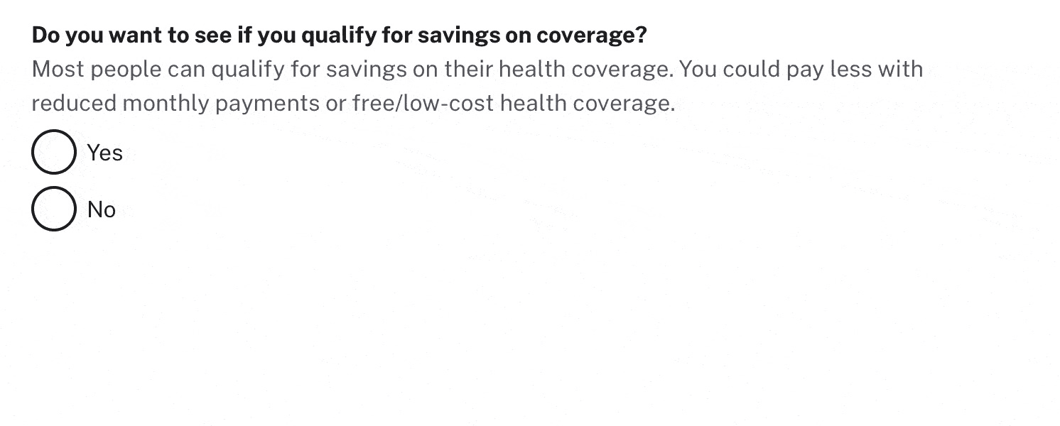
An example of a help content design pattern that guides people through what can oftentimes be a deeply personal process, one that will determine how they care for themselves and their family
While we are no longer working on the HealthCare.gov project, the design system has had a ripple effect across government. In 2018, CMS began requiring the use of the CMS Design System for all new development projects. Other agencies have adopted it as well. Aspects of our technical and design approaches were incorporated in Version 2 of the U.S. Web Design System, influencing how many government sites are designed and built. We’re excited to see how both of these design systems will continue to benefit each other. In the meantime, the CMS Design System is freely available for anyone to use.
Shoutouts
At the end of every weekly all staff meeting, it's Nava tradition to show appreciation by "shouting out" particularly special things Navanauts did that week. It's a privilege to close our week with gratitude for the work and each other.
It's with great appreciation that we shoutout the communities that support us, teach us, and cheer us on. Thank you Nava staff, alums, partners, advisors, friends, and last but not least, the Navatots who were born this past year for making the work in this report possible. For the complete list of Navafriends, see the shoutout roll call at the end of the report 🎉
Special shoutout to Vidhya Nagarajan for the illustrations in this report.